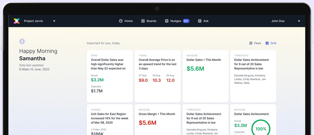
New homepage for Crux
MAY 2022 - JUN 2022
VISUAL
WEB
PRODUCT
INTRODUCTION
When the crux team pitch the product to clients, their opening line is usually something like, "We are not a dashboard product," or "We are modern and intelligent." However, when clients first see our app, it appears that we are exactly what we claim not to be, dashboards! Through this project we designed a landing page that is modern, futuristic and intuitive to our users.
FIRST ITERATION
I started with feed view first and decided to get that right before moving on to grid view. I picked up one card at a time and carefully thought about the elements that were important and ways in which I could establish hierarchy between them.
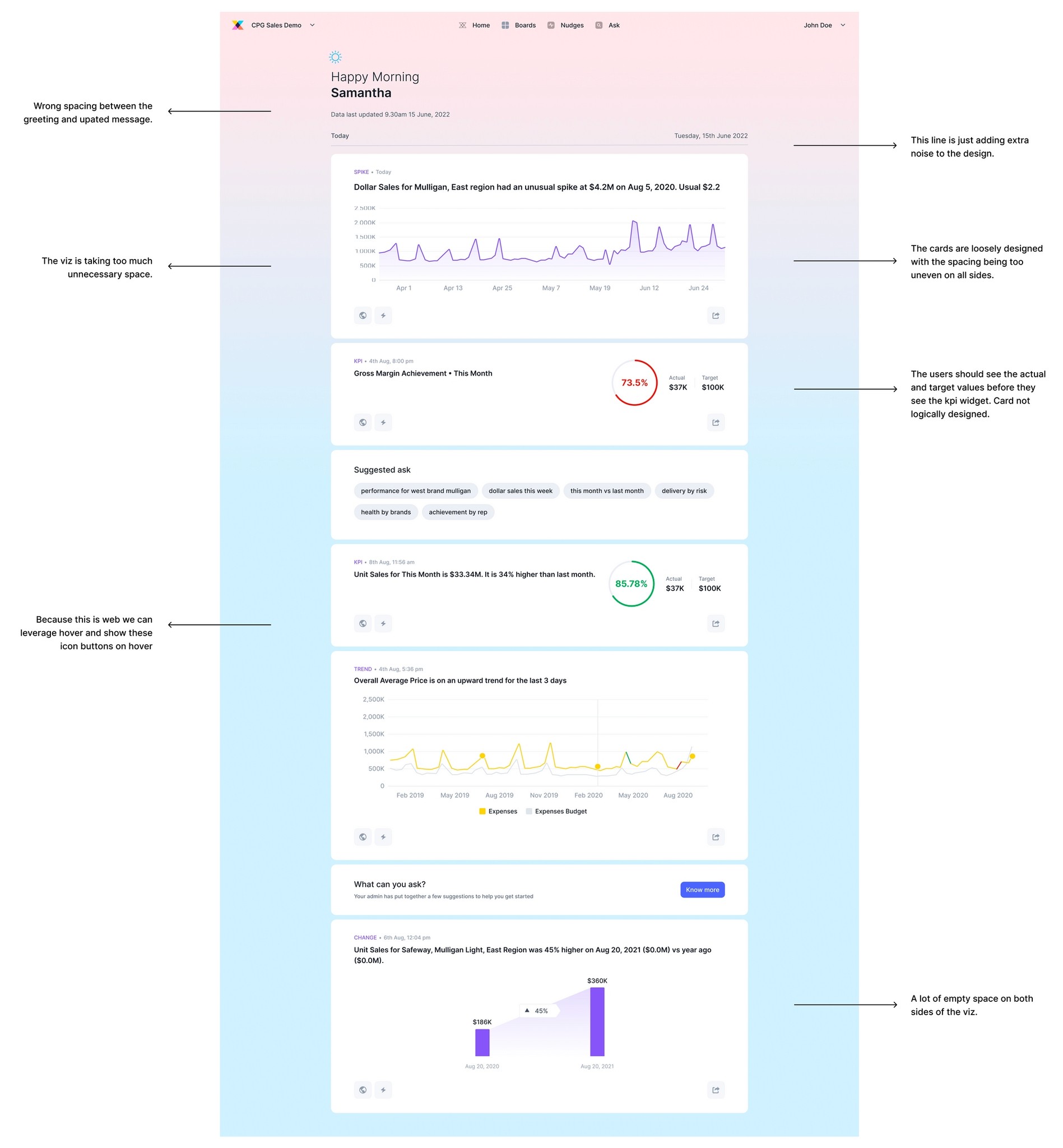
Feedback from my first iteration
SECOND ITERATION
Here I was expected to try different layouts for feed view by not sticking to one single pattern I had during my first review. My manager told me to experiment, move things around and see what works for us. Once the layout was final we would move ahead and work on finalising each card.
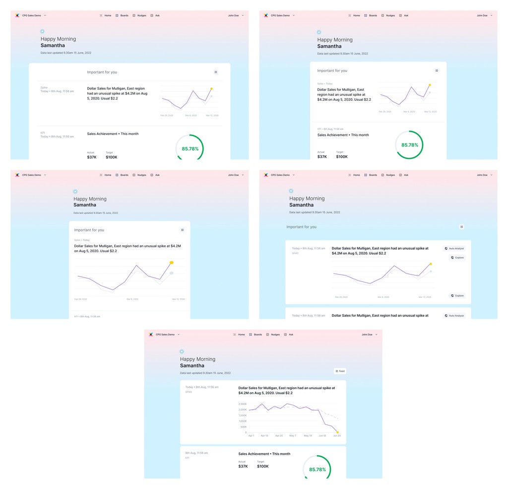
Different layouts experimented for feed view
CHALLENGES
The mobile designs were completed before this project started so the elements of the card were fixed. The challenge was to fit those limited elements on the large screen size of web and obviously make it visually appealing. The visualisations were also very difficult to work with because of the different sizes of each one of them. But then after spending a lot of time on each card and understanding hierarchy, grouping, contrast, spacing we finally did it!
FINAL DESIGNS
FEED VIEW:
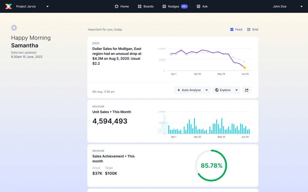
The idea was to have a distraction-free landing page where users could browse through different cards and look at the visualisation.
They can scroll through the feed on the go and get all the information they need. So the cards needed to have limited but sufficient information to fill in the users.
During a research, it was discovered that users prefer to begin their search by selecting a question from the suggested ask section, which explains the ask section.
For some cards like measure, the numbers were more important than the title so they have been highlighted.
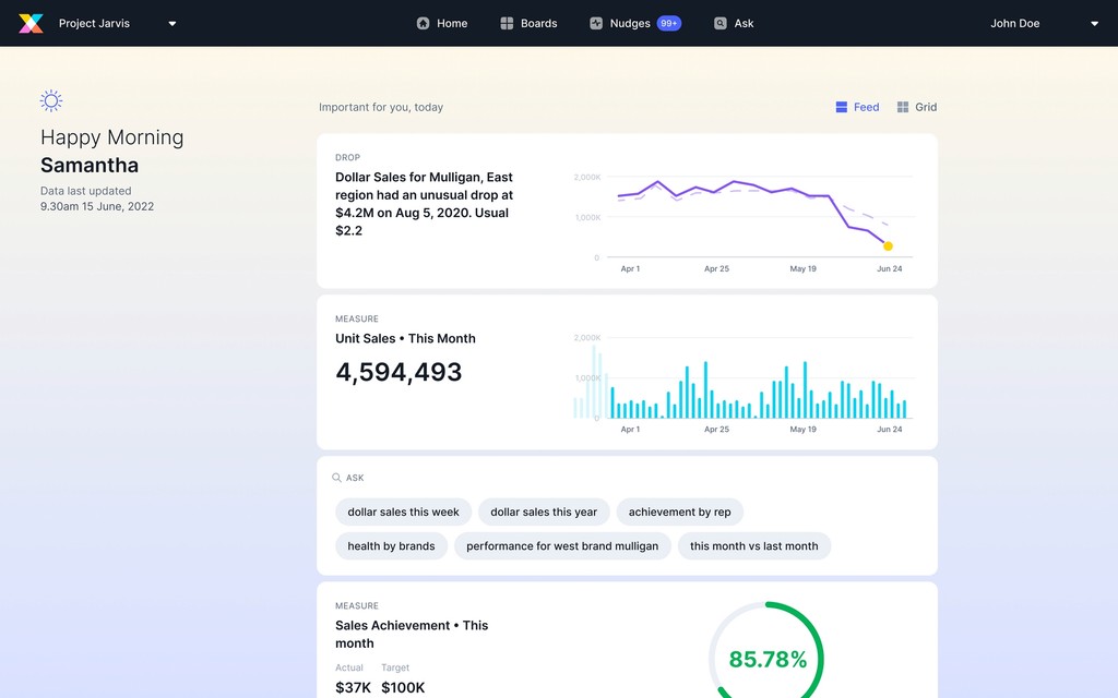
FEED VIEW ON HOVER:
The CTA buttons and date and time stamp will be shown on hover for all cards.
GRID VIEW:
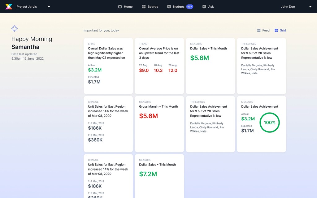
We decided on two layouts for web because we wanted to add more value with the grid layout. We were providing more information to the user in the same space, which differentiated grid from feed.
It can be a little overwhelming for the user because there are so many cards and so much information to take in. A guided experience was critical to assisting our users.
The information is organised in such a way that no element of the card appears detached. There is a predefined flow.
LEARNINGS
Hierarchy: It is important to set hierarchy for the users to have a guided experience while using your product. It can be done by typography, size, color, contrast, spacing and visibility. I can’t stress how important it is to balance all the elements so your designs are user friendly.
Grouping: Information should be grouped in a way that it makes sense when the user reads it in the order you have decided.
Spacing: With spacing you can make or break your designs. Spacing needs to be used mindfully because it can help highlight the most important pieces of information in your design.
Balance: Balance gives a design its form and stability. But it doesn’t mean elements need to be the same size, or that you must make symmetrical designs. Rather, it’s about helping the viewer’s eye travel through the content in a way that aids comprehension.
Small things matter: Changing the font size by a few pixels, altering the line height, changing the spacing. All these things matter while perfecting your final iteration. In visual design, really it’s the small things that matter!
