Capturing user journey through breadcrumbs
MAY 2022 - JUN 2022
MOBILE
WEB
PRODUCT
BACKGROUND
Crux has an ask bar that allows the users to ask anything about their business and provides an answer to the user.
On this answer that is provided, a user can perform multiple actions like modify time period, apply breakdown, benchmark, explore entities and apply auto analysis.
When the user performs any of the above mentioned actions, new answer based on the action performed is provided to the user.
The history of the answer is stored and allows the user to back track and go to any of the answer which led to the answer being viewed currently.
BUSINESS PROBLEM
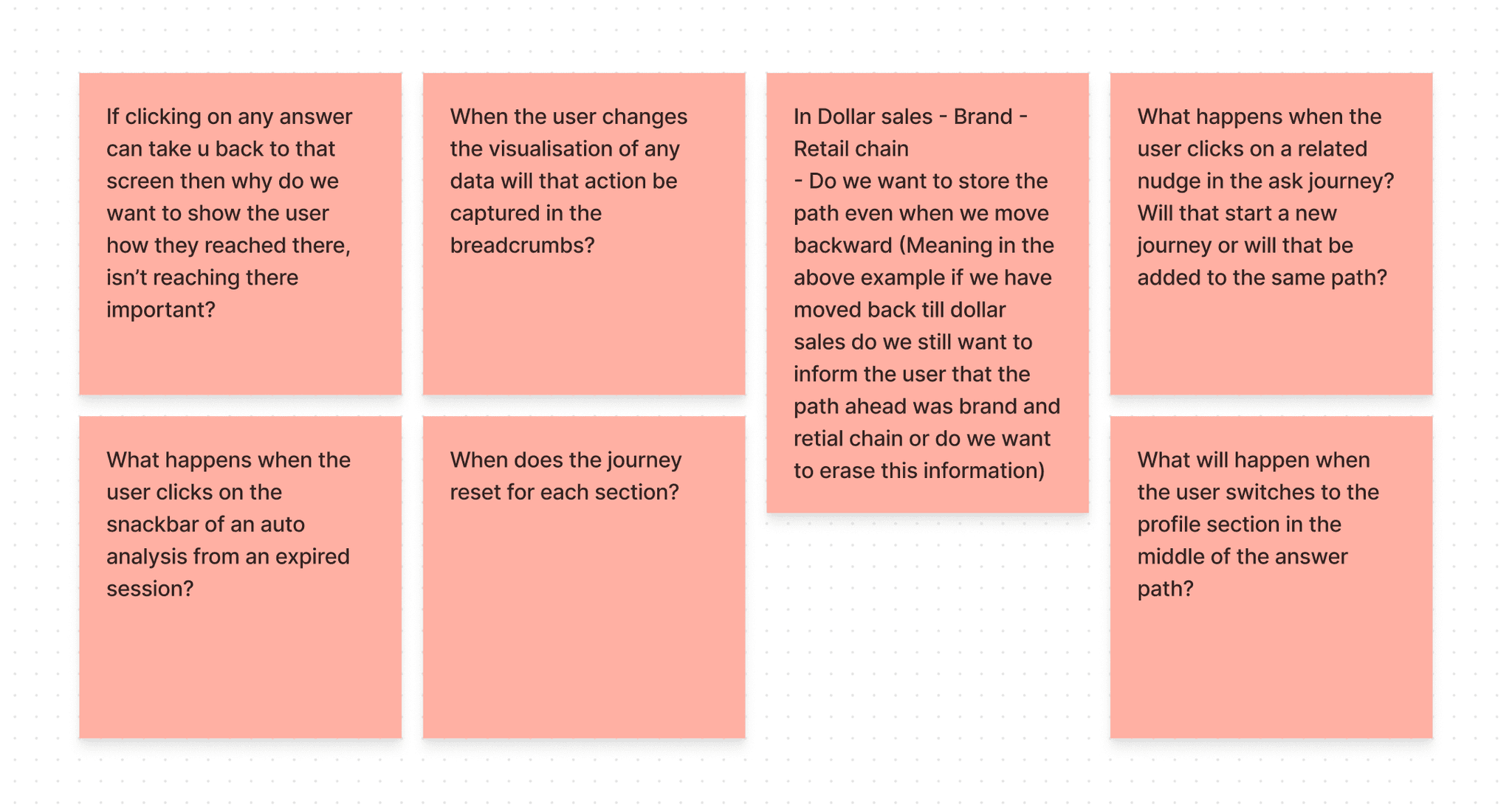
Even though answer history is provided, user is still not sure about the action performed to arrive to the answer. Only the answer titles are visible to the user.
DESIGN GOALS
The answer path should be able to explain how did the user land in the answer that is being currently viewed.
Every answer should contain the origin of the answer in the answer detail view.
User should be able to identify the actions performed, which resulted in the current answer, in the answer path.
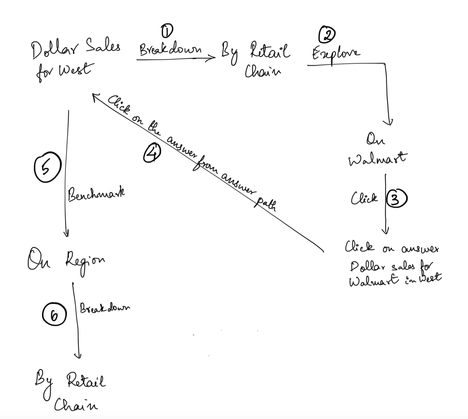
User should be able to click on any of the answer in the answer path and go backward or forward.
User should be able to follow a completely new answer path from any point in the journey.
BRAINSTORMING
MY ROLE
I single handedly delivered the web and mobile experience for all devices. There was one designer, two product managers, and four engineers on the team. It took us one month to complete the design on both platforms and prepare the handoff file.
SOLUTION
By introducing breadcrumbs we will allow the user to see the actions they have performed to reach to that particular screen.
ON MOBILE:
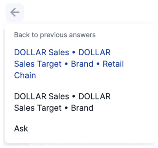
The user can click anywhere on the breadcrumbs in navigation which will open up a bottom drawer that shows the complete journey including the starting point.
ON WEB:
Similar philosophy as mobile only difference is in the truncation. On web it will start after the entire horizontal space dedicated for breadcrumbs is occupied. The user has to click on the truncated node to show all the nodes under it.
PHILOSOPHY ON WEB
TRUNCATION:
The nodes that don’t fit in the area allocated to the breadcrumb will be under these three dots.
Whether this element will have a preceeding and following arrow will depend on whether the first and last element under the dropdown have it.
FORWARD ARROW:
This arrow icon will be used whenever we move to a new node and establish hierarchy.

BACKWARD ARROW:
When the user has traversed back and performed an action on that state we will use the backward arrow to show that.
CHARACTER LIMIT:
In case of long answer titles we can truncate the middle part and show part from the end.
Character length will be 45 letters.

WEB DESIGNS
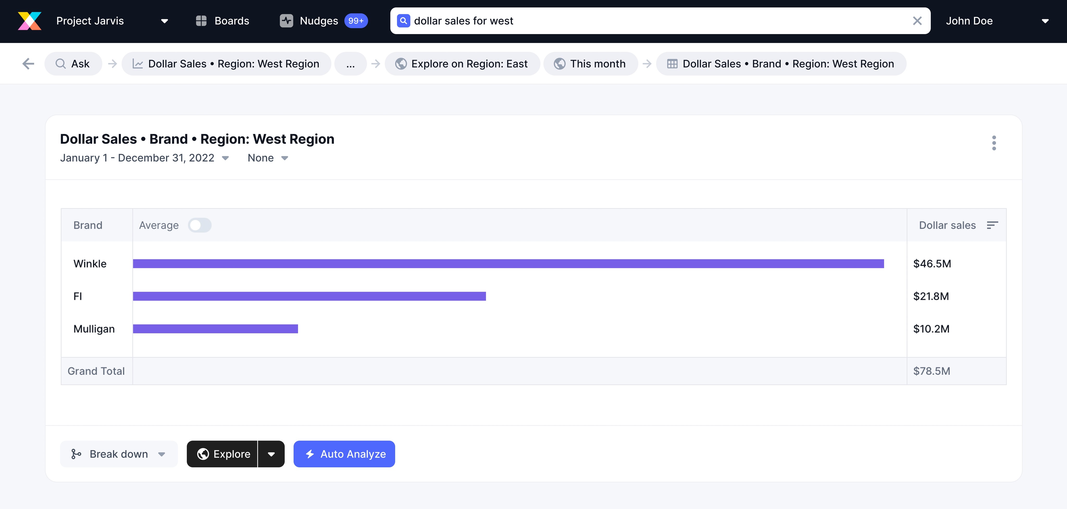
COMPLETE BREADCRUMB:
Each tab in the app will have it’s own journey captured in the breadcrumb. The first node will always be the tab/section in which the user is currently. In this particular case it is the ask tab. The truncated node has all the remaining nodes of the breadcrumb.
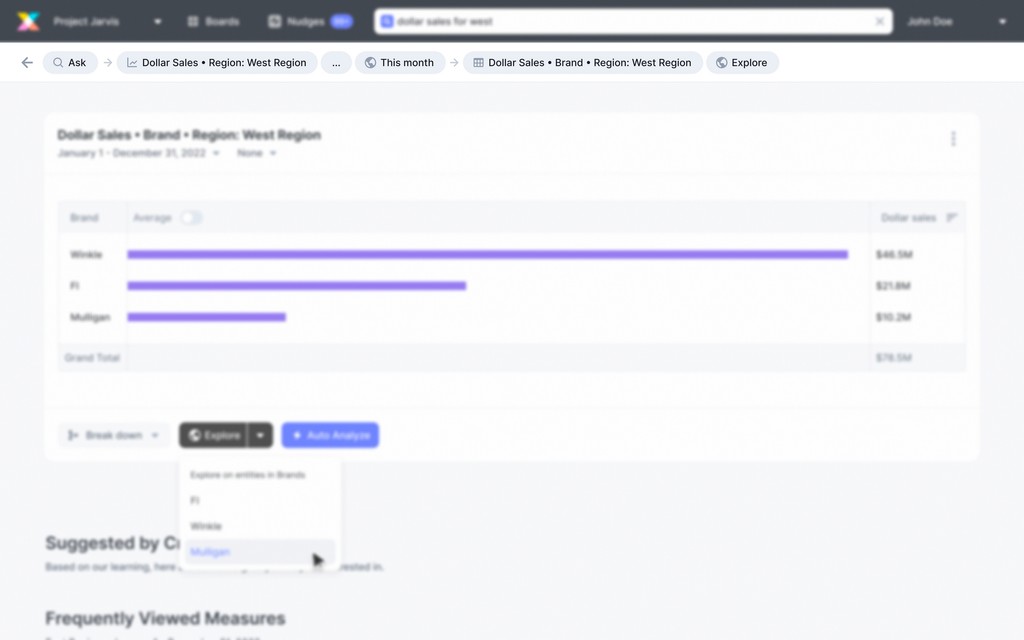
Complete breadcrumb in web
TRUNCATION DROPDOWN:
The dropdown will open up when the user clicks on the truncated node.
The nodes that were initially arranged horizontally are now vertical and the arrow shows the hierarchy as per the path.

Truncation dropdown
TRAVERSED NODE:
It will be pointlessly long breadcrumb if we added a new node for everytime a user traversed back to a node from their journey, so we decided to highlight the node to communicate to the user that they have traversed.
In any other case the last node is the active location of the user so highlighting that doesn’t add value.
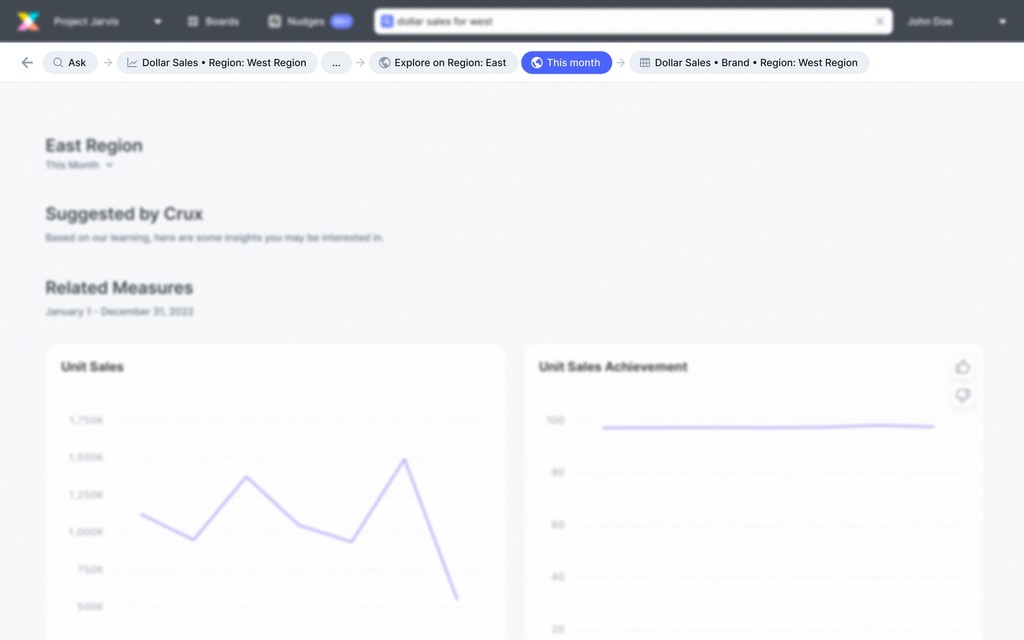
Highlighting traversed node
TRAVERSED NODE AS A NEW NODE:
The only time a traversed node will be added as a new node to the journey is when the user goes back to the state but performs a different action there. In that case we will be capturing this action and the backward arrow will be used to show it.
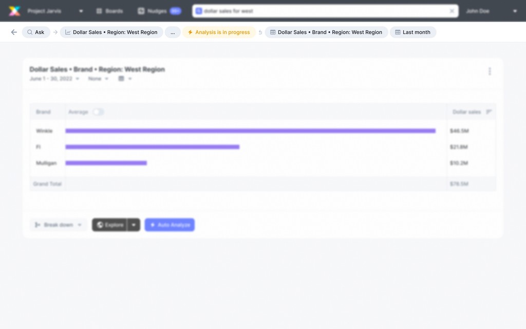
Traversed node as a new node - Backward arrow
PHILOSOPHY ON MOBILE
TWO STEPS:
The active state will be taking all the space. Only three letters from the previous answer will be added to the breadcrumb.
THREE STEPS:
The third step which is the active state for the user will be taking all the space.

MORE THAN THREE STEPS:
Incase of more than three steps the middle section will be truncated and last answer will take up all the space.
TRAVERSING:
In this case of traversing we will be showing the previous and next steps from the active answer.

TRAVERSING TO THE SECOND STEP:
In this case of traversing we will be showing the first and next step from the active answer.
TRAVERSING TO THE SECOND LAST STEP:
In this case of traversing we will be showing the last and previous steps from the active answer.

WHEN THE ACTIVE ANSWER IS SHORT:
Incase the active answer title is short the other node will take up all the remaining space.

MOBILE DESIGNS
THE BREADCRUMB BOTTOMDRAWER:
The first screenshot is when the bottom drawer opens by clicking anywhere on the breadcrumb. The active state of the user will be highlighted which in this case is the last node.
Second screenshot covers the scenario when the user has traversed to breakdown region by retail chain. We will highlight the breakdown node using our brand color and it’s parent node including all sub nodes will be shown as selected.
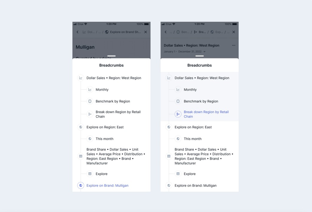
Default breadcrumb and breadcrumb on traversing
BREADCRUMBS IMPLEMENTED IN THE APP:
And, this is how we implemented breadcrumbs in our app.

Two steps, three steps and more than three steps
COMPONENTS FOR WEB AND MOBILE
MOBILE:
The bottom drawer component in mobile was very intuitive and easy to use. There were three properties for each node: whether it is a child node or a parent node, selected or not, focused or not. All the combinations possible were covered as a variant and the user could switch between any combination in just a click.

Default breadcrumb and breadcrumb on traversing
WEB:
On web the navigation component had a variant for each path that has a separate journey of its own. Boards had the hamburger menu and grid refreshed and nudges had manage interest while the other two paths were simple. Also the first node will be the name of the tab from where the journey started so having a separate variant made sense.
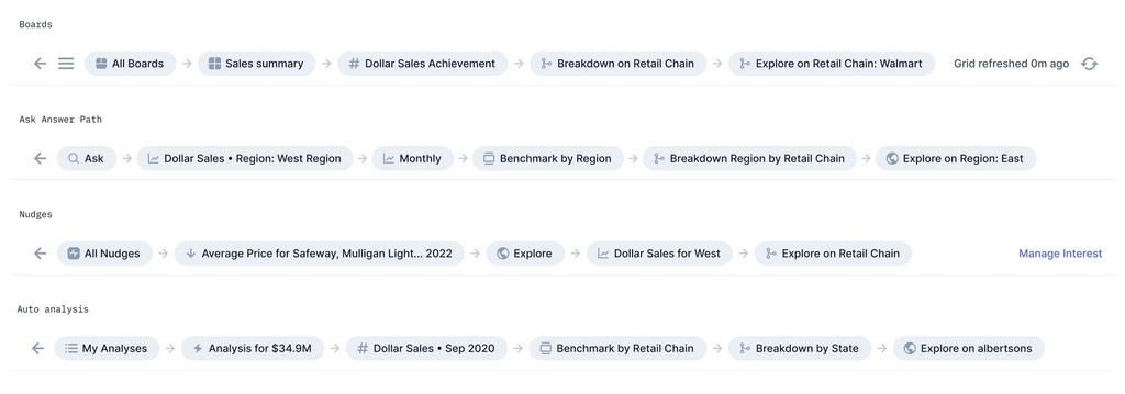
Breadcrumbs in nav bar
The dropdown was perfectly resizable both horizontally and vertically. In the main component I have added the arrow after every node which the designer can hide or use wherever required. Because the answer title could be as long as 45 characters but also shorter than that it had to be resizable. The width of the dropdown dependent on the longest answer title from all the nodes.

Breadcrumbs in nav bar
