MOBILE
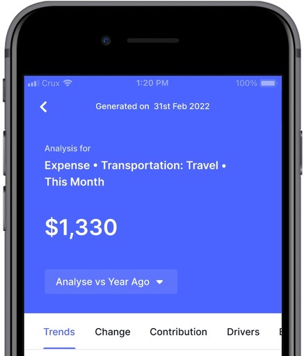
Dashboards and reports are predominantly used as the way to monitor and understand how businesses are performing. Typically numbers on Dashboards raise more questions for users than answers. When a user is looking at the number for instance, the user would typically want to analyse and understand more on what is really going on.
The task was to capture all possible scenarios that pertained to the project. Since it was a new feature, all the screens from onboarding to error states had to be designed. We introduced a new primary button for auto analysis, in-app onboarding, redesigned tooltips, introduced multiple snackbars interaction and list view.
Designed the entire experience on mobile for iOS and android devices, under the guidance of a lead designer. The team had one designer, one lead designer, two product managers and four engineers. It took 3 months for the project to be implemented.
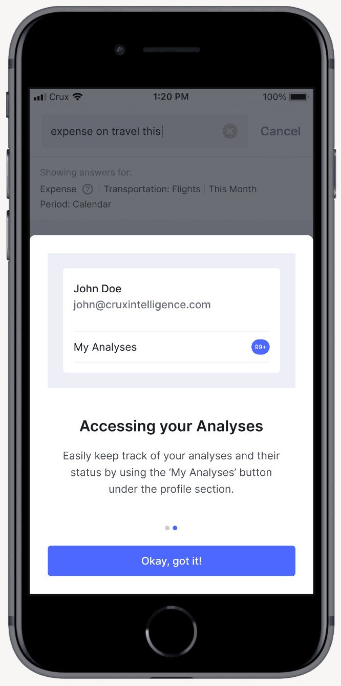
We presented the onboarding screens when auto analysis was visible to the user for the first time. We had to cover two things first what is auto analysis and second how can the users access their triggered analysis. The feature did not have a place in the bottom nav bar so we had to educate the user on where to find it.
Consider the possibility that your favourite app introduces a new primary button and you are completely unaware of it. We did everything we could to ensure that the user did not feel that way.

AUTO ANALYSIS SNACKBARS
We updated the snackbar interaction across the app while working on the screens for Auto Analysis. There were multiple questions like what if there are multiple snackbars showing at the same time because auto analysis can be triggered on multiple answers, how long will a snackbar be visible, can the user dismiss them, etc. So we came up with a solution that solved for all these problems.

Snackbar interaction
GENERAL GUIDELINES FOR ALL SNACKBARS
All snackbars will have a time duration of 5 seconds.
Snackbars can be killed by swipe interaction.
The distance between two snackbars when they are stacked will be 8 pixels.
If any snackbar from a stack is swipped and removed all the snackbars above it will move downwards.
AUTO ANALYSIS LANDING PAGE
We decided to use list view for this page. We wanted to display all of the user's analysis as well as their states. The top portion has filters that allow the user to focus on a certain type of analysis at a time. For example, clicking on unread will display all unread analyses, as would clicking on finished, in process, and queued. Following that, I created a scroll view of the landing page as well as a loading screen.

Report screen landing, scroll view, heading tooltip
AUTO ANALYSIS REPORT SCREEN
The report screen starts with a card where as per hierarchy the number is highlighted because analysis is performed on that number. Next we have the tabs where clicking on any option will take the user to that section of the page. On scroll we minimised the entire card and showed the answer on which analysis was performed. The tooltip opens when the user clicks on any of the section headings.
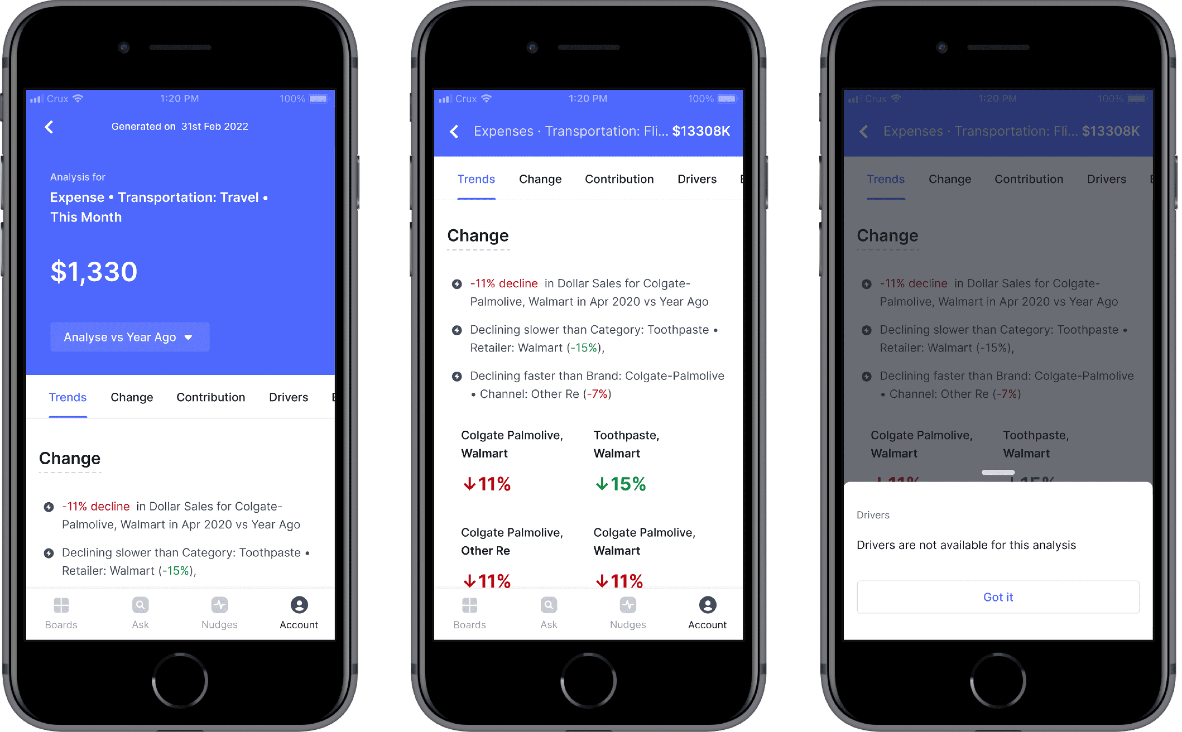
Report screen landing, scroll view, heading tooltip
AUTO ANALYSIS DELETE INTERACTION
A swipe to delete interaction for list view analysis. This interaction will be the same for both iOS and android devices just the UI of the dialog box will differ.
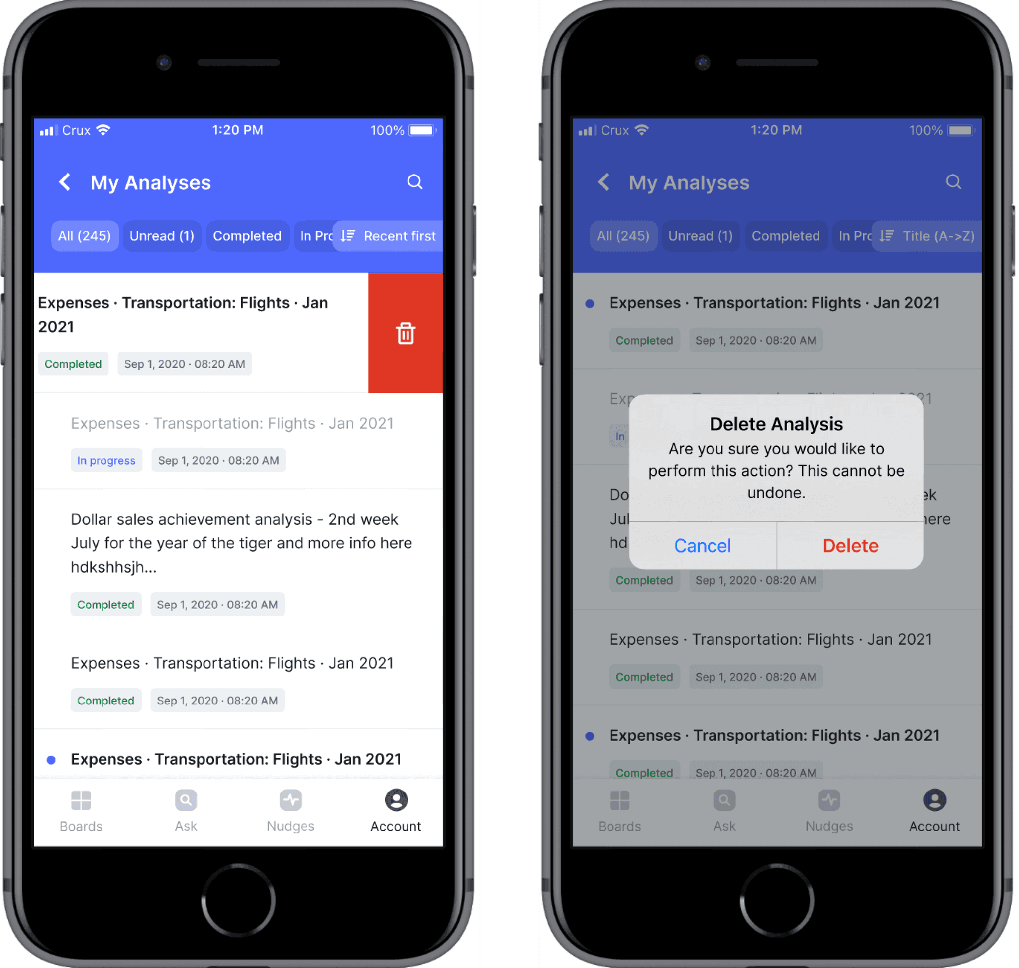
Delete interaction
AUTO ANALYSIS ERROR AND EMPTY STATE
Incase of a network issue a possible loading error may occur, allowing the user to reload the page again. Another instance could be when the user has not triggered any analyses. In that case a message stating the reason why no analysis are available and a CTA button to ask a question is displayed.
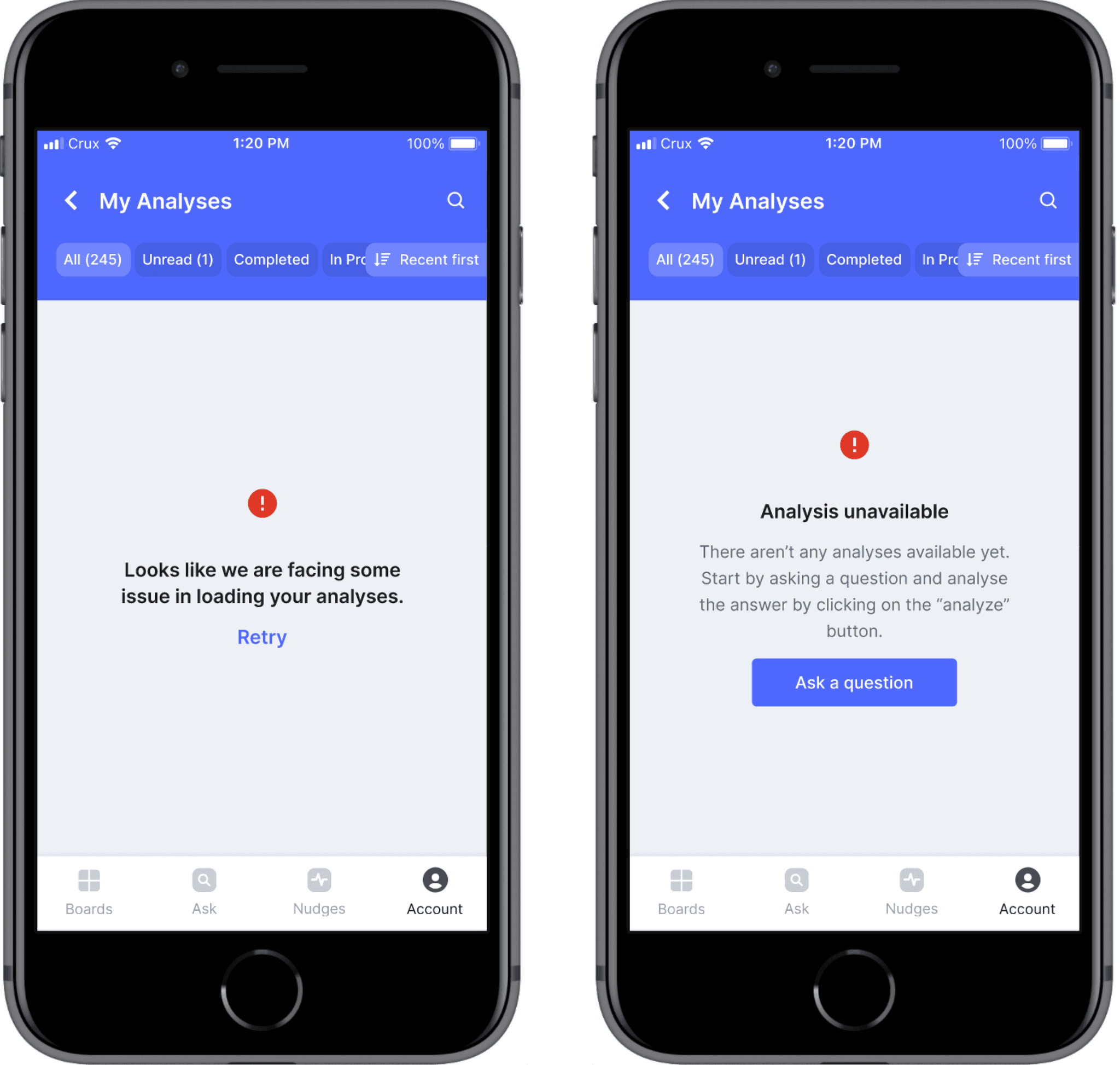
Error and empty state
AUTO ANALYSIS LANDING PAGE - SEARCH SCREENS
If the user has a specific analysis they want to look for then they can start typing the answer title in the search box. We have covered states like what happens when the user clicks on the search box, then when they start typing and when they click on enter.
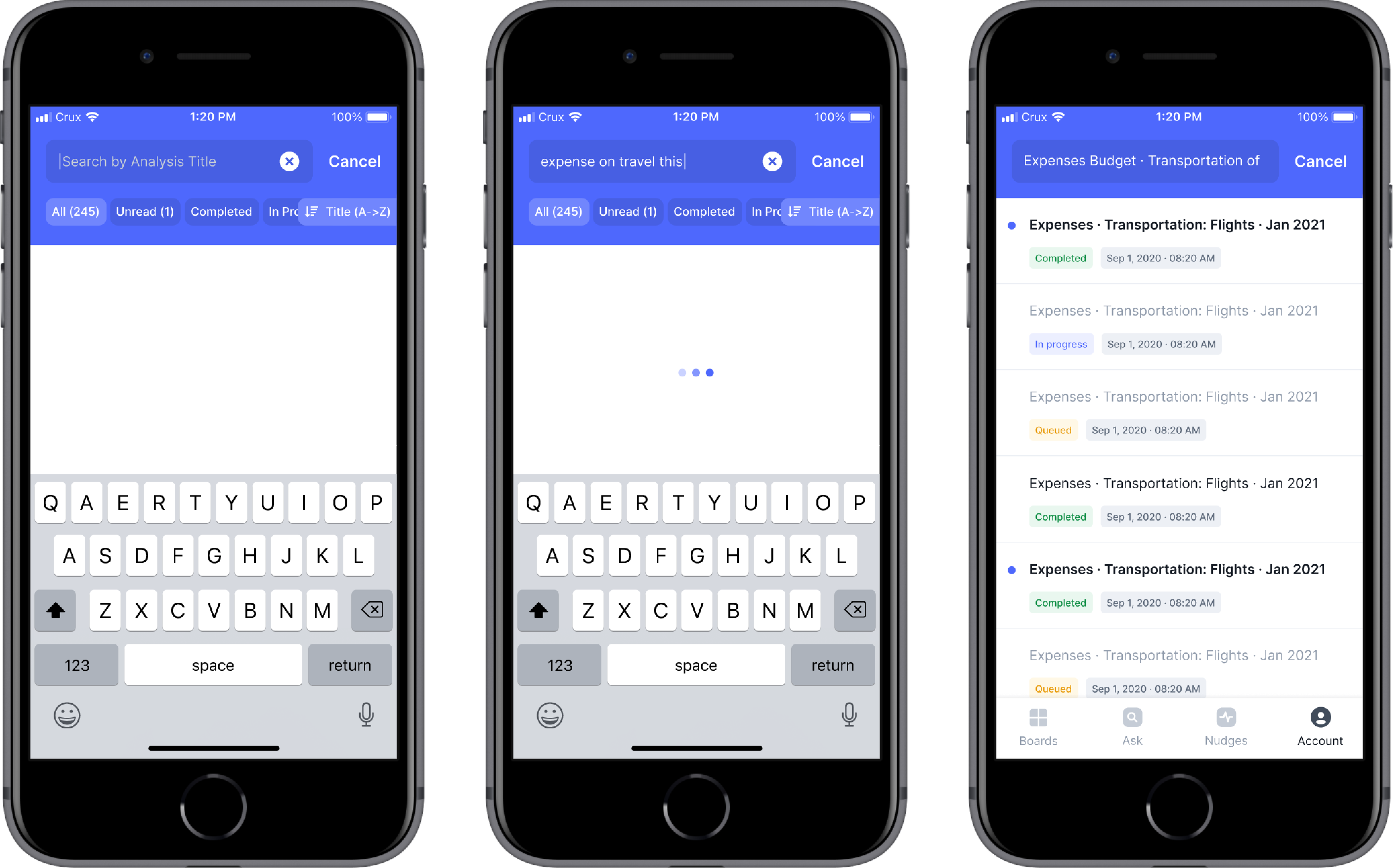
Search screens
CONCLUSION
What began as a feature addition resulted in numerous changes to the apps key interactions. While designing, I learned about prototyping, documenting decisions, and thinking through all possible scenarios.